By My.Games
In March of 2022, an idea was born in our marketing department: Rush Royale, our hit mobile game that combines elements of tower defense and card collection, was ready for its own cinematic. We quickly realized it would be difficult to interpret the performance of just one cinematic video. With that, we decided to diversify our chance of success, and we started simultaneous production of three different cinematic videos. Two were created in-house, and one was produced by an outsource studio.
Hello, my name is Anton Neznamov, and this is the story of one of those in-house cinematics: how we made it, the challenges we encountered, how we braved them, and the overall experience. We’ll also discuss our successes (and failures), and I’ll offer advice for those setting off onto similar adventures.
Analyzing our characters from a high level
Let’s start by looking at the things we needed to consider before ever animating a single frame. Up front, our main goal with the cinematic was to develop our characters’ images, and to create a strong emotional impact that would resonate with viewers.

The image above shows how characters look in the game. In terms of game design, they’re perfect: attractive, and easily distinguishable on the game field. However, they’re tough to operate in terms of marketing:
- They have no eyes, which are crucial for expressing emotion.
- They have no lore or background, and it’s hard to tell stories that will really connect potential players to the characters.
We decided to use 4/5 characters players get in the starting deck. Why not all five? Two of these are mages that differ only in terms of magic ability (fire and ice) and color (one is red, one is blue). We decided that this level of similarity would only complicate things, so we cut the amount of characters to four.
Defining our initial concept
The concept for the cinematic was simple: «combat with gags» — our characters would be defending the castle (Rush Royale, is, after all, in the tower defense genre) from oncoming enemies, all while getting into funny situations.
From here, we decided to start by developing character backgrounds, and then we’d write the jokes based on that.
Fleshing out our characters
For each character, we only had names and icons. They were: Archer, Cold Mage, Engineer, Priestess. We first tried to develop them using archetypes described by Pearson and Jung, but that didn’t really go anywhere. So then, we came up with the following structure to guide us:
- Who is the character?
- What do they want?
- What are they afraid of?
- What are their strengths?
- What are their weaknesses?
After a couple of brainstorms, we were able to answer these questions for each of our four characters. For instance, let’s look at the «plot» skeleton for our Cold Mage:
Who:
- A young mage, 25 years old. Self-confident like Draco Malfoy, Prince Charming.
- Like a celebrity blogger, a show-off, narcissist.
- He has a grasp of his magical abilities, but is not completely in control of them.
- Magic is just normal for him, it’s not really his main interest in life.
- Son of a famous wizard, he grew in the shadow of his father, that is why he wants to become famous.
What he wants:
- He wants attention and to create a cool image of himself.
- He wants to be adored and admired.
- He wants to prove to his first magic teacher that magic is not crucial to have.
- For him, it’s not so important to win a fight, as much as getting cool photos where he looks like a winner.
What he’s afraid of:
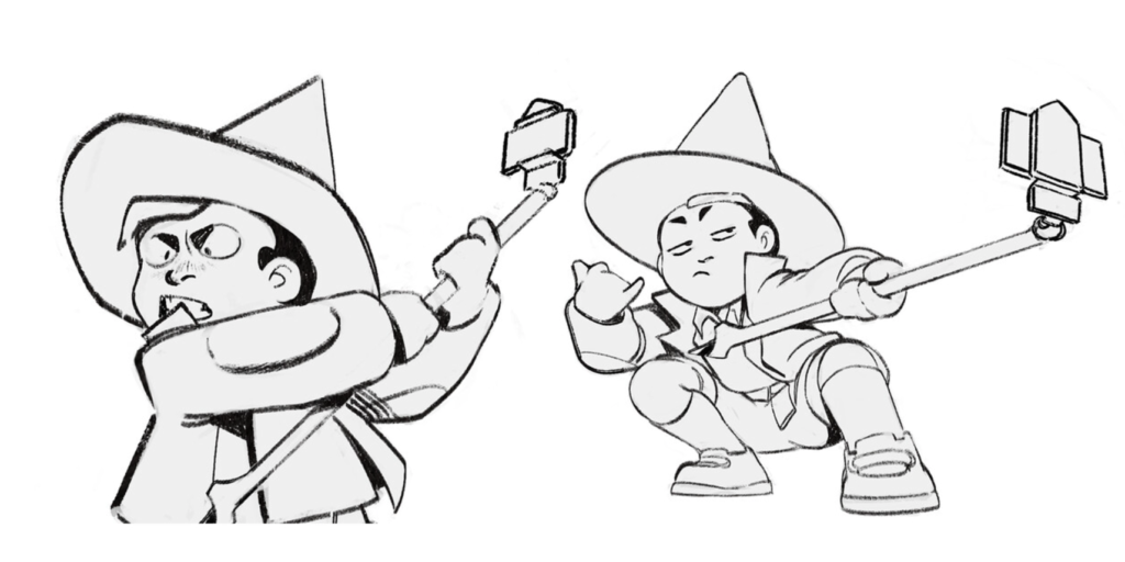
- He fears ruining his image, making a mistake, or that no one will like him. And also, he’s afraid of showing any fear.
- He’s afraid that no one will be around to witness his victory.
- He is wary of strong opponents.
Strengths:
- If he falls, he makes it look like it was planned that way.
- Tireless optimist.
- Handsome, good looking.
Weaknesses:
- Superficial, doesn’t take anything seriously.
- Selfish, doesn’t empathize with anyone, and does not help.
- He doesn’t care about practicality, for him, style is most important.
Concept art
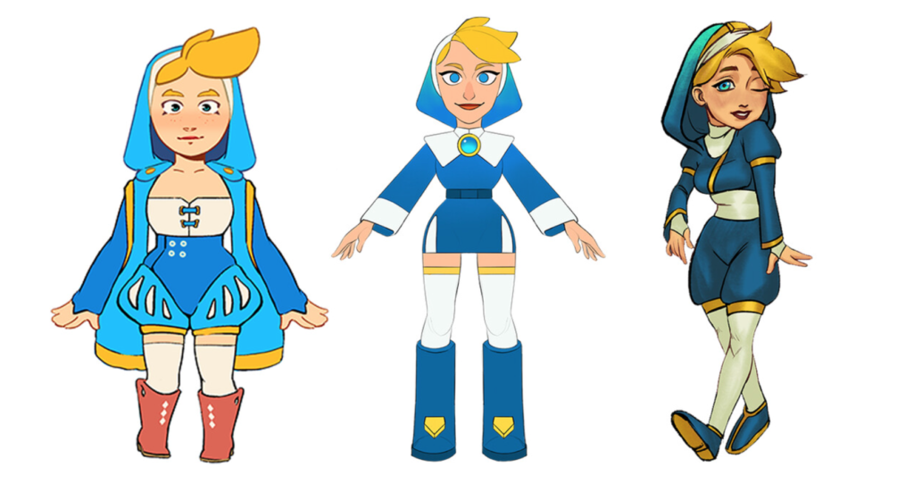
The final character backgrounds were sent as technical assignments to concept-artists. We decided to bring in three artists to get different perspectives and to have more choices. These are the final concepts of the Priestess character from three different concept artists:
And here are some WIP sketches:
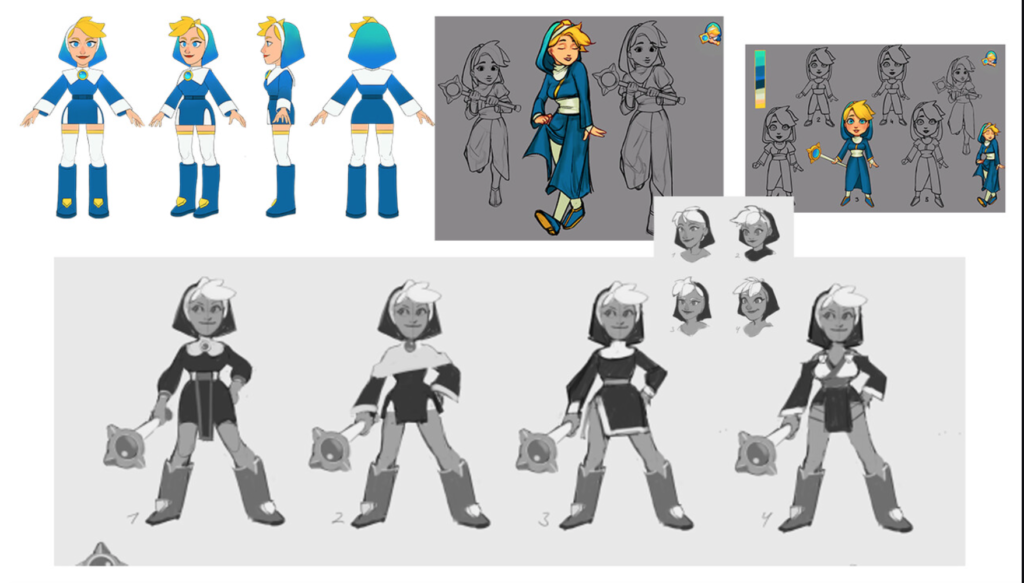
The designers developed dynamic postures and emotion maps according to the character concepts:
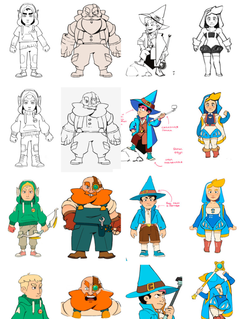
And all the concept artists worked independently. Minimal restrictions concerning forms and color were given here. The idea was to find artists with great personal visual style, give them a textual description of a character, with no references except the game images, and to let them express themselves fully.
Selecting the final concepts
Below are the final concepts we ended up going with; we felt they were closer to the game style: the moderately exaggerated body proportions added to the humor, while the large facial features open up wide opportunities for working with facial expressions.

With the character concepts, we started to make a draft animation, a raw version of the cinematic, which is essentially a slightly animated storyboard. This helped us start to get a feel for the tempo of the video, and to make some decisions related to camera framing and the shots we wanted to use.
This raw animation evolved alongside our concepts.
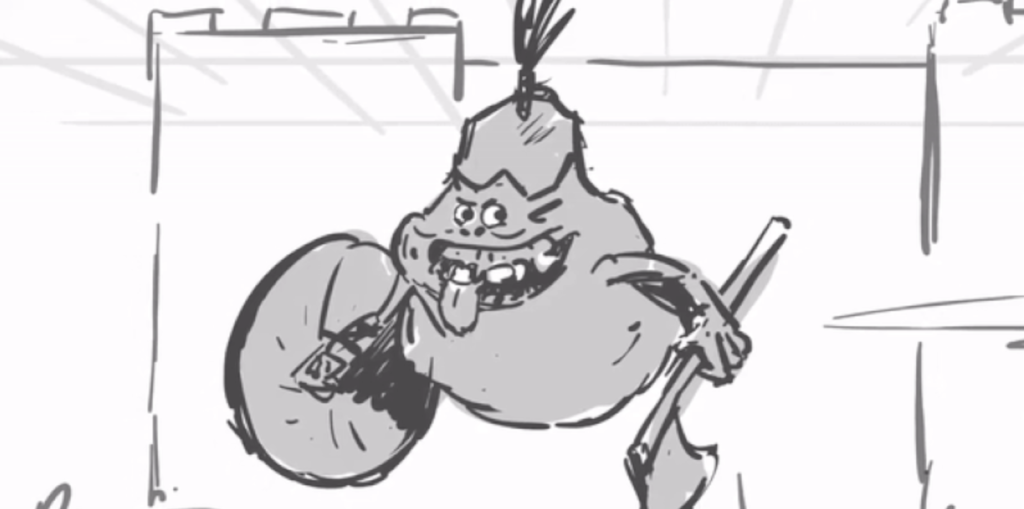
At the same time, concepts for various props and the environment were also being developed, as you can see below.


Modeling the characters
In order to properly explain how our character concepts were transformed into fully-realized animated 3D-models, a small digression is necessary.
And, for teams focused on bringing characters like these to life, each of these roles is typically carried out by a separate specialist.

We did not have such specialists in our team, so while we were working on our character concepts, we were also actively hiring artists. (As luck would have it, our team manager, Kseniia Vorotyntseva, did an excellent job and all the specialists were hired in time.) Thus, by the time the concepts were finished, we already had signed agreements with several modeling artists. Some of these folks were assigned to the main team, while others were waiting on the bench in case something went wrong.
And things did go wrong.
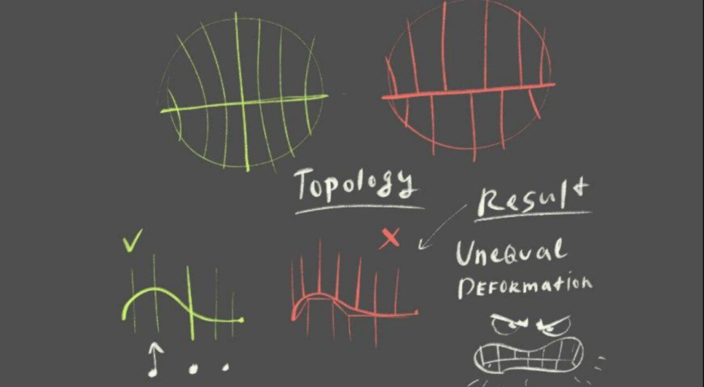
Let’s unravel what happened. In addition to the 3D-model artists, by the beginning of the modeling process, we had also already recruited a team of riggers (specialists who create character skeletons), and we had also found a lead animator. If we had instead decided to hunt all the specialists sequentially, the process would’ve stretched on considerably longer and there would have been downtime. To explain: cinematic models can contain details necessary for animators, so it’s good when the 3D-artists, riggers and animators are able to work closely on the model from the very beginning. If they were to work on the model in sequence, the process would turn into an endless series of edits and throwing the ball from one field to another.

We thought we were insulated from the above issue, but then a problem came out of nowhere. All the 3D-artists we invited had experience creating models for animation in their portfolio. But we could only evaluate the final results in their portfolio. What we didn’t take into account was how much of that work rested with their past supervisors. To make a long story short, we didn’t have a strong lead modeler, and this error was a stumbling block.
The riggers were the first to sound the alarm when they found errors in the model meshes preventing the rig and skin from being created.

These mistakes were exacerbated by the perfectionism of some of the riggers and animators. They demanded to do everything by the books, endlessly sending likes to tutorials and articles, despite the fact that there can be several approaches to modeling and rigging, all of which are valid. We needed results, and unfortunately, part of the team had to be let go.
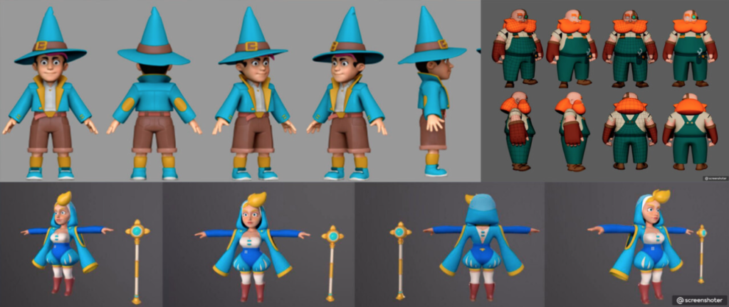
The lack of a lead model artist led to a delay in the deadlines, but in the end we formed a methodological guide for the modelers and riggers, which greatly accelerated the work.
Getting into the animation
In order to meet the deadline, we split all the shots between several animators.

By dividing the timeline into shots with corresponding references, we were able to better prepare for the animation itself.

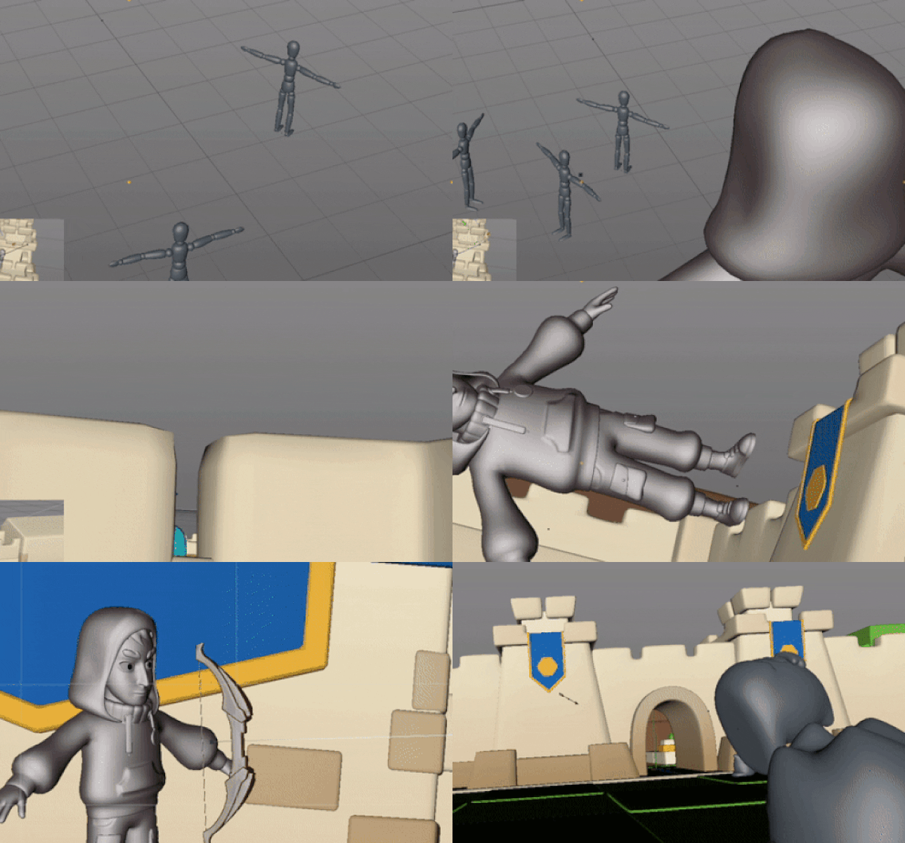
But the lack of a layout (a 3D draft of scenes in 3D) was another setback. We had decided to ignore this part of the process, and this was a mistake.
Thus, we had a very detailed draft animation (which we were completely confident about) but the animators still did not have enough to make the final camera angles.
The experienced animators had no problems here, but some of the newer animators were really just working with the cameras for the first time, and for some of the shots we had to make a layout during the animation process itself.
Furthermore, some more expected obstacles cropped up, for instance, animators missed deadlines, or had to re-evaluate their own abilities, and change deadlines. We were ready for this, as we had spare performers and a strong lead who could jump in at critical moments and save the day. Unsuccessful shots, which even after a number of edits did not meet the requirements, were transferred to the stronger animators.
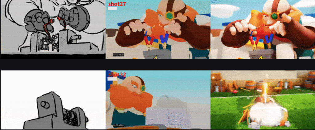
The project lead, Sergei Baev, spent more than one hundred hours patiently and painstakingly analyzing the details of the animation, correcting arcs and timings. And the team (and Sergei’s polishing in particular) paid off, the animation turned out the way we intended it: simple, with a vibe to hook viewers, and an inherent emotional resonance.
Adding VFX and Sound
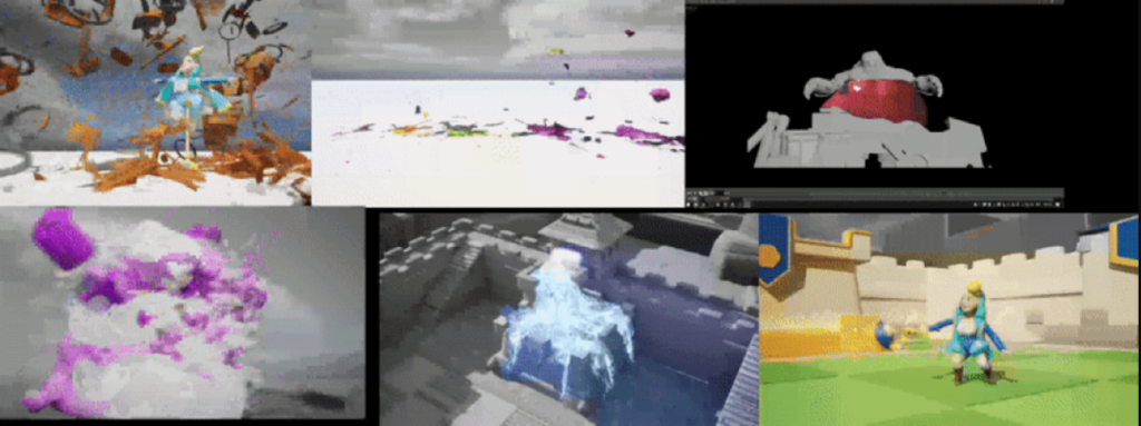
When creating visual effects, two features had to be taken into account:
- We would use Unreal Engine.
- The effects should fit in the established style.
Effects related to destruction, slime, and liquids were composed separately in Houdini and transferred to the Unreal Engine using the alembic format. We wanted to convey the materiality of the enemies, including their shape and their texture, something similar to jelly. And, in order to match the cartoonish style of the characters in the game, we ditched the physical simulations of hair and cloth. Without these, the animation could have looked less «alive», but thanks to the elements of physical destruction and the scattering of opponents, we were able to add some action to the proceedings.
We did not want the magic effects to clash with the style, so the easiest way to do this was to create them entirely in Unreal Engine. (And this is exactly what we did.)
To soundtrack the video, we composed a remix of the game’s main theme: some of the music was written from scratch, sound effects were recorded in the studio, including with the involvement of voice actors.
Adding the sound made the video’s impact even more vivid, and added further to the comedy.
Conclusion
So much work for just one cinematic might seem like a bit much, but in fact, we got more than just one cool cinematic out of this experience.
Our team now has the skills, built-in processes and manuals to produce story videos. Plus, our characters now have a strong foundation, and we can use that basis to build any plot we’d like going forward. And storytelling is very important both for attracting new players and for maintaining the interest of old ones.
Looking back, we can say it’s not a good idea to start work without strong leads whose experience and skill can be relied upon at critical moments. These leads are also needed because they can act as arbitrators in controversial situations. And we learned that the earlier a mistake is made, the more it will snowball and cause problems in the future; this applies to all stages of development: from the script to post-processing.
On the flip side, it helped tremendously to have a plan with adequate estimates for all stages; this helped turn the chaotic process of creative research into a predictable, and more or less manageable, adventure.
Thanks for reading, and we’re looking forward to seeing the results of your own cinematic quests!


