Summoner’s Rift isn’t just a map. It’s our basketball court, our MMA octagon. It’s a place where relationships are forged, where players refine their game over the years, and where the best in the world become legends. In a game with endless character matchups and ever-evolving strategy, SR was the league’s only constant for five years. We were hesitant to tinker with such a vital piece of the League puzzle, but we felt excited to take on the challenge.
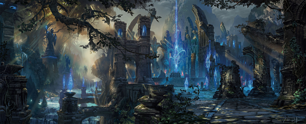
As league grew, so did our aspirations to refine its design. Updating Summoner’s Rift was an opportunity to raise the bar and give players better visual clarity, more thematic cohesion, and a stronger aesthetic that could endure the test of time.
ENVIRONMENTS Summoner’s Rift
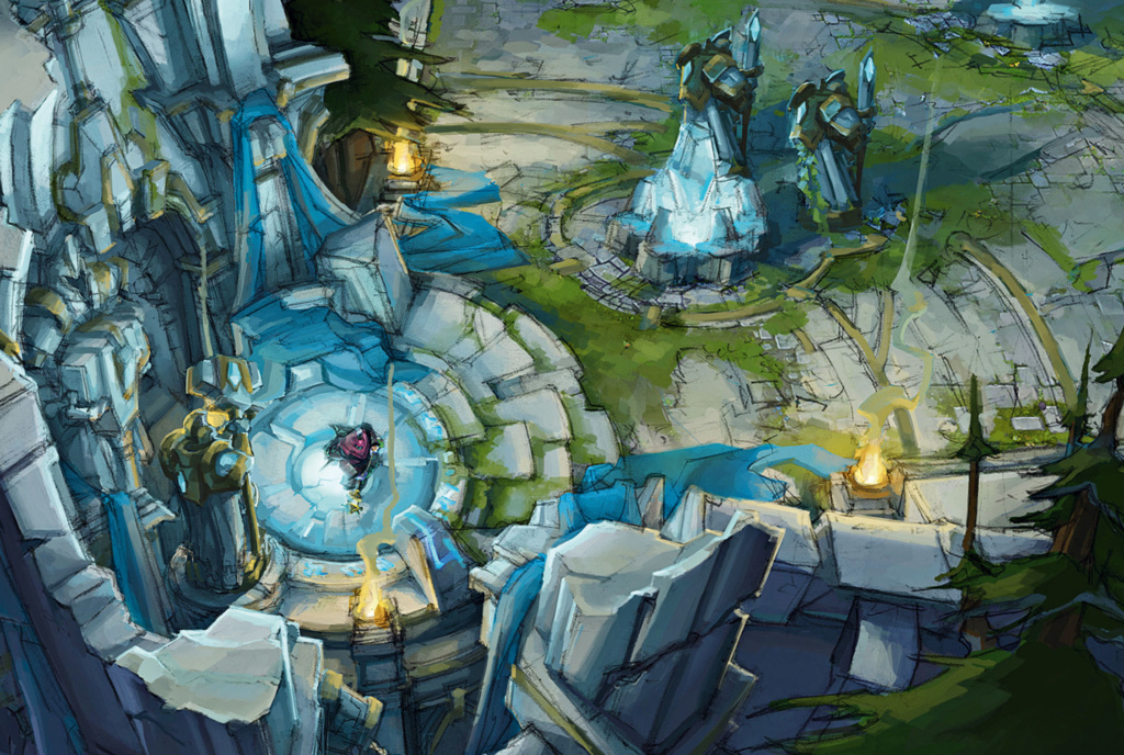
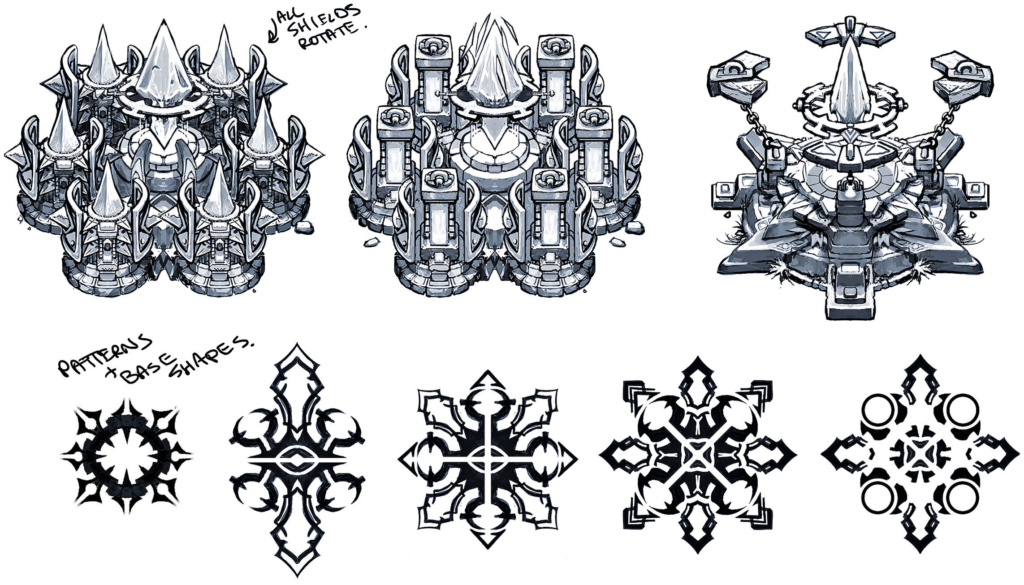
The Rift is comprised of two sides: red and blue. The blue side represents “order”, as suggested by its stone tablets inscribed with arcane text. Its defensive structures (turrets) are massive replicas of the paladins thought to have once kept Runeterra safe from magic.
The red side is a more magical, chaotic place. Instead of the blue side’s legal tablets, charms are inscribed in the stone floor of the red side’s fountain and abandoned weapons are littered throughout the forest. We didn’t want it to look more evil than the blue side, so its jungle is populated by friendly woodland critters(just like the blue side), and its red buff is guarded by an owl, suggesting knowledge and wisdom amidst the chaos.
North Jungle Concept
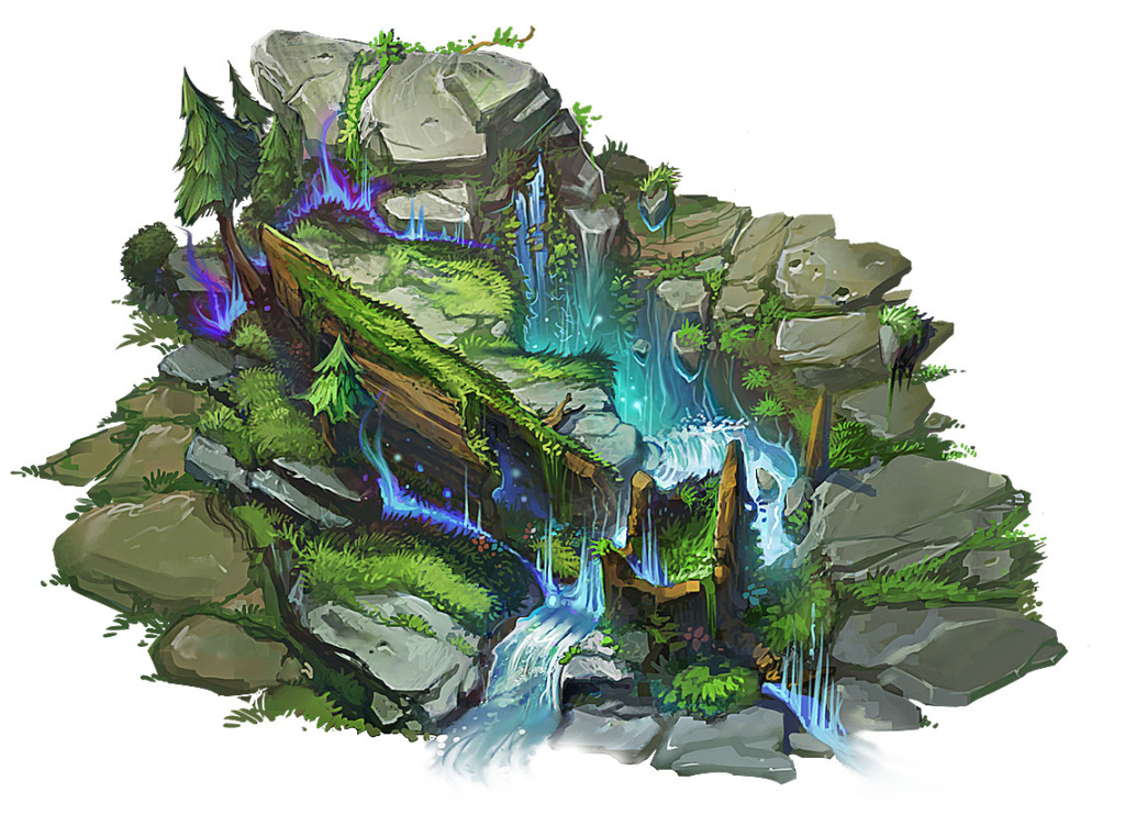
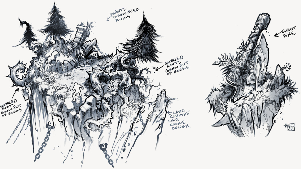
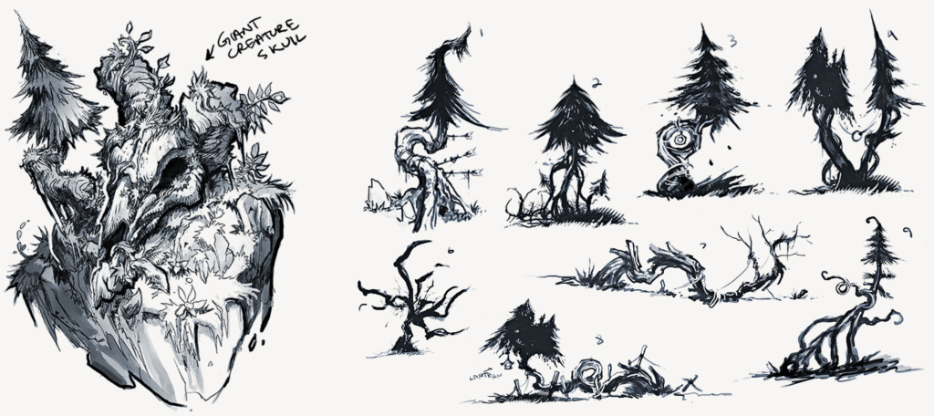
Island thematic exploration


Early base architecture studies
Pillar and Wall interaction
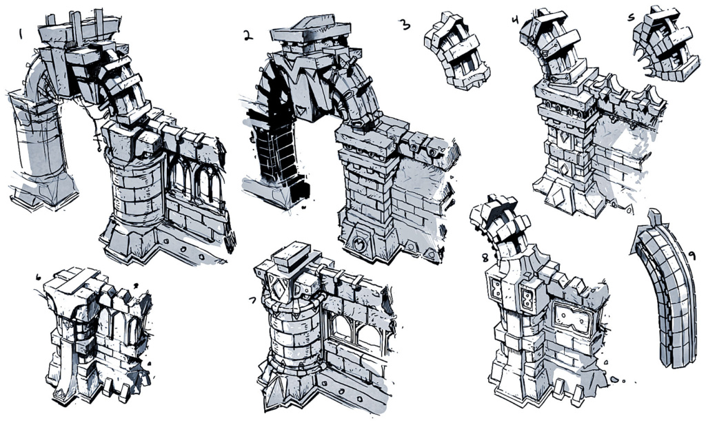
Rampart ruins concept
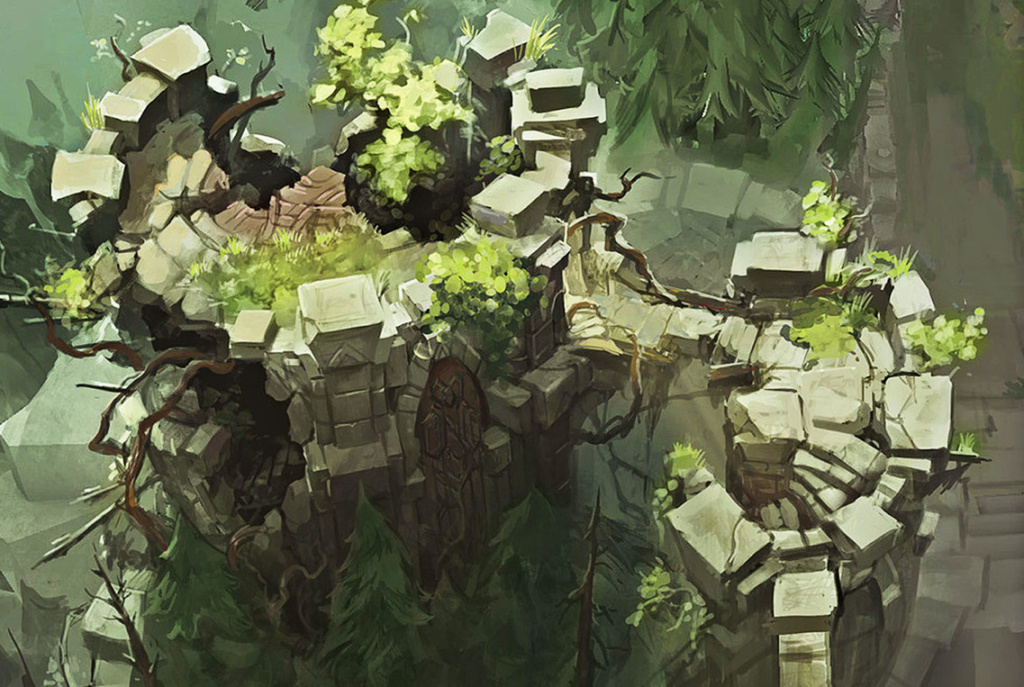
North Vista Concept Variant
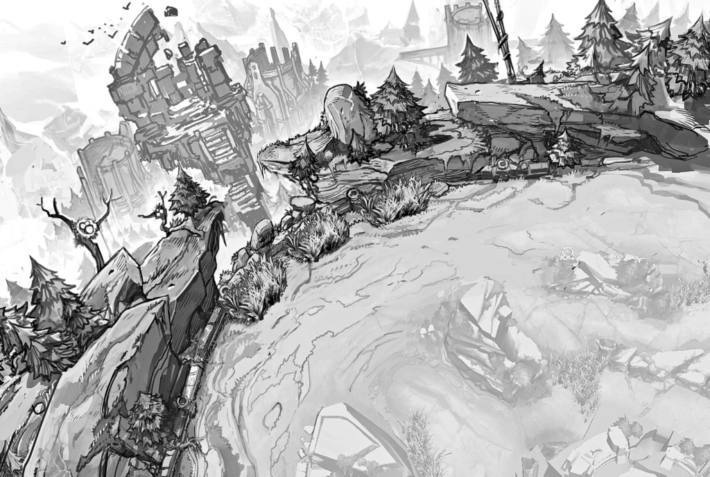
Midlane
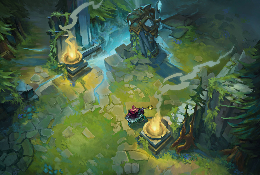
Blue base
